This is the writeup of Experiment Three of our open-analytics experiments on AskThem, conducted with support from Google Civic Innovation. Background on this project.
This was in the queue, but was pushed ahead by a conversation with Tom Steinberg of mySociety (UK), our widely-respected non-profit advisor. Tom’s pioneering work in civic tech is still leading the way and is one of the main reasons my friends and I conceived of our non-profit all the way back in 2004 – I’m grateful to have his input & insights, and take it most highly. Now let’s see how he did.
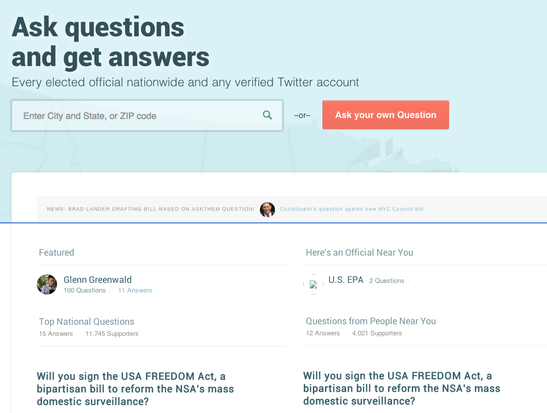
AskThem can support a lot of user-generated content: questions about any imaginable issue, some timely & some evergreen, to any level of government, or any verified twitter account. The question with the AskThem homepage is priority: to highlight popular questions and questions that received a response, to explain how the site works with good question content; or to funnel visitors into the question-asking / question-searching-by-address process themselves for other conversion goals.
The original design of AskThem’s homepage had two medium-size columns, one of top questions nationally, another of questions near the visitor, based loosely on IP address location. The three-circle info-graphic on “how AskThem works” is pushed down the page by this interesting but wordy content. It also offered two above-the-fold options for visitors: enter a zip code or street address and search, or click the orange “ask your own question” button.
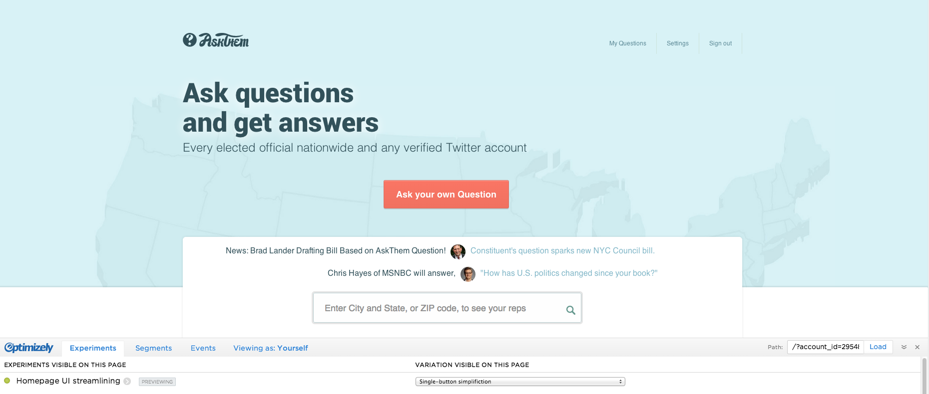
Tom Steinberg suggested, over video Skype chat, two tweaks that my development team and I were considering, but elevated in our priority queue to test – that conversions would be increased by simplifying the showcased content on homepage to one participating elected official and one participating verified Twitter account. In addition, in his recommendation the “ask your own question” button takes sole priority above-the-fold, and the address search text field is pushed down, as it’s less priority in this variant. (Think of how this design works better on mobile, especially, as both Tom and our analytics recommend.)
There was another copy-edit that was tested simultaneously, as part of experiment four (also from Tom’s suggestion), but disregard that for now, as the UI & design changes are significant here b/w A & B. Experiment started Apr. 17th and is still running, with two goals – overall engagement (clicks anywhere on the page) and clicks specifically on the “ask your own question” button. The results so far:
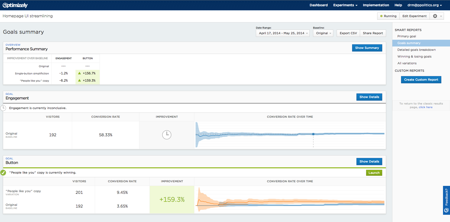
The results show that overall engagement is slightly down, which is what one would expect – with the streamlining (B) taking away much question content, there’s many fewer question-titles on which to click, many fewer faces of question recipients on the homepage. So overall clicks are a wash.

But somewhat remarkably, clicks on the “ask your own question” button itself were way up, 156% over original, so much so that Optimizely called it a winner quite a while ago – which makes sense, as it’s now the primary action that a visitor can take above-the-fold (no opportunity to enter a ZIP code, city/state, or address), but still:

… so we have solid ground to conclude that simplifying the homepage offerings gets visitors into the ask-a-question flow much more productively. From there, tracking bounces & conversions is a bigger question – but foregrounding the “ask your own question” button got 1.5x results, more than a sufficient margin to declare it a winner. Pending more extensive user surveys and research, it stands to reason that moving up the “how AskThem works” info-graphic helped visitors understand the site’s functions. For funneling visitors into asking a question themselves, simpler UI proved effective. The experience & insights of Mr. Tom Steinberg proved themselves, in this case, valid & sound, and I look forward to treating Tom to NYC tacos as a thank-you for his suggestion during the upcoming Personal Democracy Forum. Tom, thank you, the Mexican cuisine offer is a standing one, anytime.
From these revealing & crucial analytics experiments, my open-source development team and I now have empirical evidence on how we can enhance our non-profit platform. From here, I have other good homepage revisions to connect visitors to their local elected officials – but we need charitable funding support to continue operating and move towards sustainability. Please support our non-profit work. Questions, comments: david at ppolitics.org.